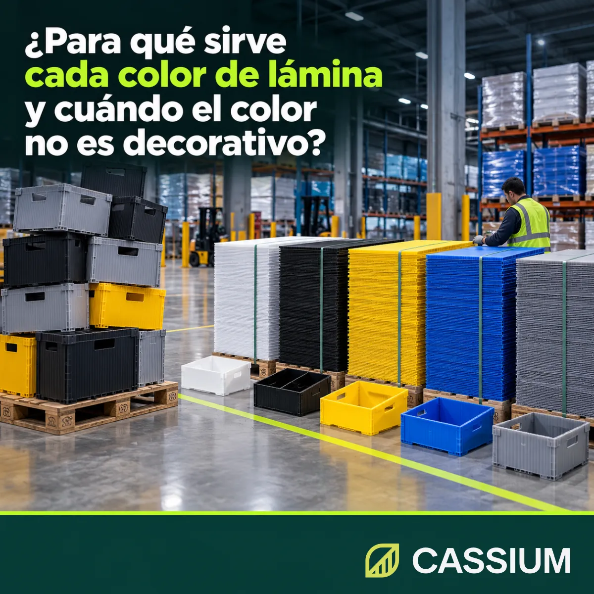
Sheet color helps you identify, separate and warn within your operation. It becomes a technical specification when a plant code, a safety rule or a cleanliness inspection depends on it.
Why a change in shade can send held product to your customer's line
In a plant, a container's color is read before any label. An operator can tell from several meters away whether a box is going to production, to quarantine or to a specific customer, and decides without stopping to read.
Color as a visual code: area, status and destination
Color codes in sheet packaging answer three questions. The first is about location: which area, line or warehouse the container belongs to. The second is about status: whether the contents are released, on hold, in rework or ready for disposal. The third is about destination: which customer or part number the part belongs to.
When the code works, nobody thinks about it. Every separation that color handles is one your team no longer has to read, verify or ask about.
The shade that changes without quality noticing
The risk appears when the code lives only in the plant's habits. If color is missing from the drawing, the purchase order and the receiving criteria, any change of supplier, inventory or budget can alter it without anyone detecting it.
The consequence rarely shows up at receiving, because the sheet meets gauge, grammage and size. It surfaces weeks later, on the floor, when two statuses that color used to separate end up mixed.
What each color in our line handles on the plant floor
At Cassium we make corrugated polypropylene sheet in five standard colors: white, black, yellow, blue and gray. Each one has uses where it works best, and knowing them helps you assign them with sound criteria instead of choosing by taste or by whatever is in stock.
White: visible cleanliness and contrast for printing
White shows dust, grease and any residue at a glance. In areas where packaging cleanliness is inspected, a dirty tray is spotted before it goes back to the line. It also offers the highest-contrast background for screen printing and digital printing, useful when the part carries instructions or codes.
Black: an even tone that hides wear
Black hides marks, scuffs and dust, and keeps an even appearance after many cycles. That is why it works in containers and dividers under heavy handling, where visual wear on a light sheet could be mistaken for real damage.
Its weak point is heat. A black sheet exposed to direct sun absorbs more radiation than a light one and reaches a higher surface temperature, a fact that matters if the part spends hours in a yard or next to an open dock door.
Yellow: warning and visibility at a distance
Yellow stands out from several meters away and in low light. Your plant's safety signage already associates it with caution, so your people understand it without additional training. It works for temporary guards, barriers and containers for material awaiting a decision, as in the opening case.
For the same reason, it pays to reserve it. If yellow shows up across the whole fleet, it loses its strength as a warning.
Blue: contrast against the product
Blue contrasts with most foods and agricultural products, which is why it is a common choice in food plants and packing houses. If a fragment of a blue tray breaks off on the line, the operator or the inspector can tell it apart from the product more easily than a white or gray fragment.
Gray: the neutral tone for the general fleet
Gray hides warehouse dust better than white and looks less heavy than black. It is the natural base for general-purpose packaging. Using it that way leaves the strong colors free for the exceptions that must draw attention: on hold, priority or a specific customer.
The costliest mistake: expecting color to deliver a property only the formulation provides
Color is visible at a glance, while additives stay hidden. That leads to a common confusion: assuming a certain shade brings a technical property with it. Each special property comes from a component dosed into the blend during extrusion and specified separately.
Sun protection comes from the UV additive, in any shade
A sheet that will work outdoors needs the UV retardant additive, whether it is white, black or yellow. Without it, radiation degrades the polypropylene, the surface turns dull and brittle and the part loses strength sooner than expected. Our Recommender adds the UV additive automatically as soon as you indicate outdoor use, whatever color you choose.
Antistatic: a property measured by resistivity
In packaging for electronic components, the property that matters is electrostatic charge dissipation. In our ESD variant, that property comes from the antistatic additive built into the compound, and we document it with the resistivity levels your process requires. A dark container without that variant can look identical to a dissipative one and behave like common plastic when a discharge occurs.
Flame retardant and corona treatment: invisible properties
The flame retardant additive and corona treatment for ink adhesion cannot be seen either. A treated sheet and an untreated one look identical until the print peels off at the first rub. Both features go in writing on the purchase order, just like color.
When color becomes a technical specification
Color moves from preference to requirement in any of these situations:
- When it identifies an area, a quality status, a customer or a part number.
- When it is part of your plant's safety signage.
- When cleanliness or foreign material inspection depends on contrast.
- When the part works in the sun and the shade changes the heat it takes on.
- When the part carries your brand image in front of your customer.
In any of these cases, color is written on the part drawing, on the purchase order and in the receiving criteria, with the same rigor as gauge and grammage.
Standard color or special color made to order
The five standard colors cover most plant codes. When your brand or your customer calls for another shade, we make special colors to order. To match it, the most reliable reference is a physical sample or the exact code from a color chart; a description such as “corporate blue” leaves too much room for interpretation.
A special color is defined before the run is scheduled, because the color concentrate goes into the hopper along with the polypropylene. Changing it with the extrusion line running costs the same time and material as any other specification error.
Lot-to-lot consistency: the approved standard
A color code works as long as every lot looks the same. We compare each lot's color against the approved standard before releasing it, and we keep a record of the run. On your side, keep a reference sample in quality and avoid mixing sheets from different lots in the same parts order when the shade has to match.
How to assign colors in your plant without creating a code nobody follows
Few colors, one meaning for each
A code with too many colors forces people to memorize a chart, and on a shift under pressure nobody checks it. A gray or black base works better, with two or three strong colors that each carry a single meaning. Make sure none of them clashes with your plant's safety signage.
The code in writing, from the drawing to the floor
Document the code in a short procedure: what each color means, who can use it and what to do when a container shows up in the wrong area. Copy the color into every purchase order with its reference, and check the shade at receiving against the quality sample.
At Cassium we extrude 2 to 6 mm corrugated polypropylene sheet at our plant in Santa Catarina, Nuevo León, under our ISO 9001:2015 quality management system. We make it in white, black, yellow, blue, gray and special colors to order, with the color built into the compound and checked against the approved standard in every lot. We send you a free sample so you can confirm the shade and variant in your process.
If the color of your containers separates something important in your plant and it is still missing from your purchase orders, the next order is the time to write it down. At Cassium we make 2 to 6 mm sheet in five standard colors and in special colors, checked against the standard in every lot. Find your starting gauge, grammage and variant with our Recommender.